Use this form to generate a graph of differences in artist popularity between two countries:
You'll need an SVG viewer plugin for your browser to display the graph.
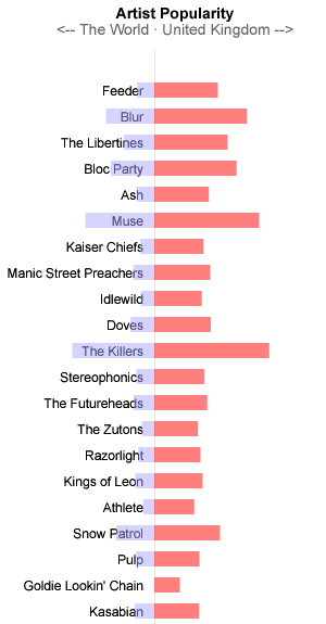
The data comes from Audioscrobbler, which produces charts of artist popularity for users who have linked themselves to a particular country.
The graph shows popularity in different countries on either side of the axis. Artists are sorted in descending order of 'difference in popularity'.
Here's an example screenshot: